Attribute Visualization
Theory
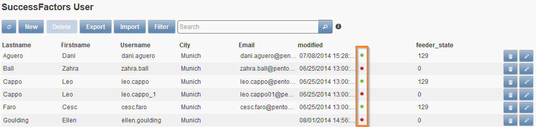
Facing a list view with several employee entries, it can be painful to remember the current filling state of each entry. Internally, “feeder_state” signals readiness for export when “129” and “0” if not. To make this information more intuitive, an icon can be used to graphically visualize this information. In the consecutive figure, the green and red dots or bullet points represent such an icon.
How to realize the screen above
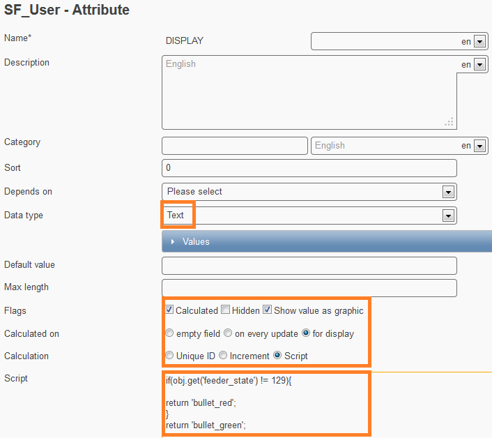
- Create a new attribute
- Optional:
- Translate it with a whitespace to hide the technical name of the attribute. Do this for every language. (Be aware that that the label in the record itself will be empty too.)
- Set an attribute description to display at icon mouse-over, to provide the user with a hint of the icon’s meaning) (E.g.: Red bullet = incomplete; Green bullet = complete)
- Data-type it as Text
- Flag it with calculated, hidden and show value as graphic
- Tick for display
- Fill in the script below
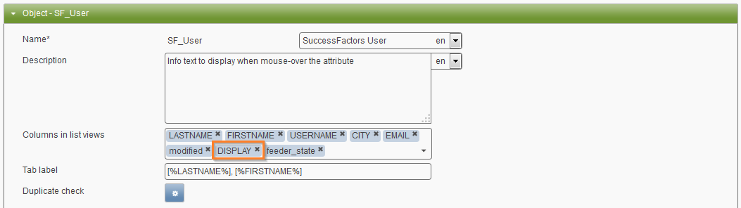
- Add this attribute to the Columns in list view field of your data object (e.g. SF_User).
Visualizing Code for the feeder_state
var fs = toStr(obj.get('feeder_state'));
if (fs != '129') {
  return 'bullet_red';
}
return 'bullet_green';
Alternate with disctinction of potential duplicates:
var fs = toStr(obj.get('feeder_state'));
if (fs == '32') {
  return 'alert_red';
}if (fs == '33') {
  return 'alert_green';
}if (fs == '129') {
  return 'bullet_green';
}
return 'bullet_red';
Available Icons
Generally, any icon from the jQuery UI Themeroller can be utilized. Pick a desired icon, hover over it and the icon’s name will show.
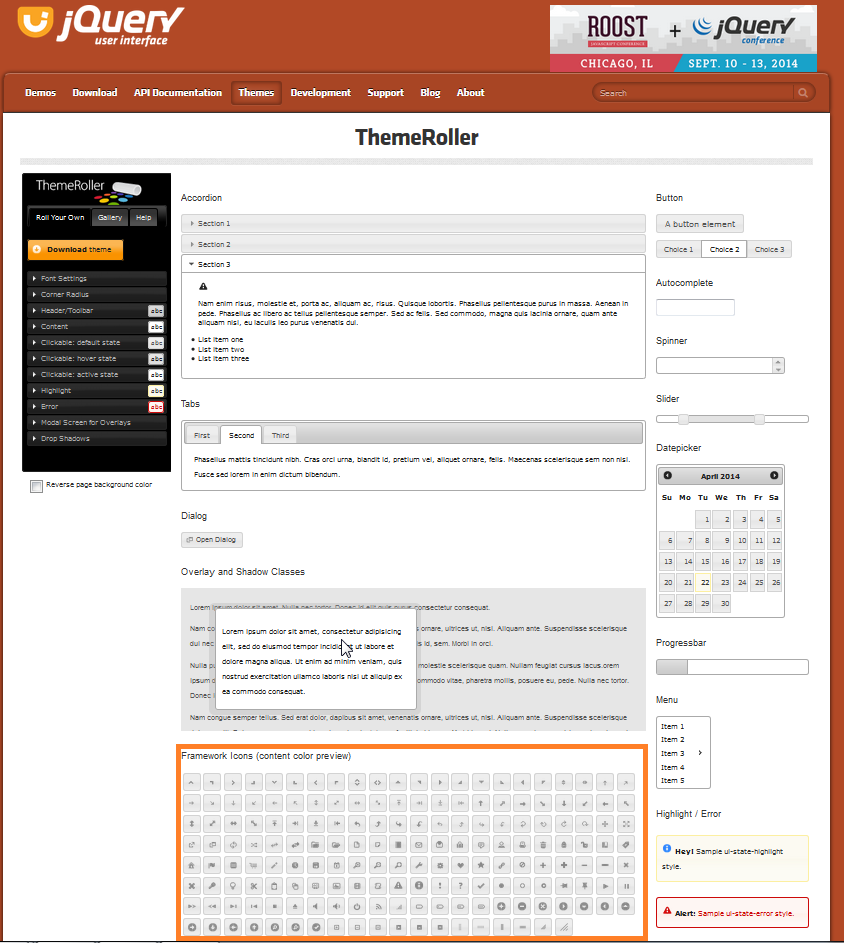
To address it in Feeder, drop the prefix “.ui-icon-“ and add the desired color, which can be red, green, yellow, blue or the jQuery UI standard like error, highlight, default, focus. The resulting syntax will be like “icon_style” or “icon_color”. In the use-case above, the Themeroller’s .ui-icon-bullet was chosen and became “bullet” only. Then colors were added to the icon’s name: “bullet_green” and “bullet_red.”
- Examples:
- close_red
- pin-s_blue
- notice
- check
- close_default
- close_highlight
Note
If a jQuery UI Theme changes, the standard style colors may also change because of the related theme colors. Nevertheless, red, green, yellow and blue keep their colors. If no style is defined, the jQuery UI’s default style color will be used.
Multiple Icons in a Column
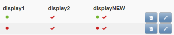
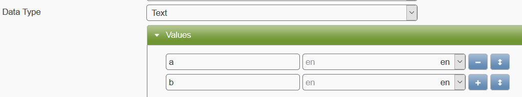
As of version 1.10.5, you may visualize different information using one field only (instead of two separate attributes). Let’s assume you would like to visualize the feeder_state and another field. The other field (“visual”) is configured as a Text field that can be either ‘a’ or ‘b’.
For displaying muliple icons, we need to use an array (list). In the given code it is called “icons”. Depending on the states of the fields, we add (push) different icons to the array before displaying them via the return statement. This code needs to go to the field that we want to use for the visualization (here: displayNEW).
var icons = [];
if (obj.get('feeder_state') != 129) {
    icons.push('bullet_red');
} else {
    icons.push('bullet_green');
}

if (obj.get('visual') != 'a') {
    icons.push('check_red');
} else {
    icons.push('check_green');
}
return icons;
The following screenshot shows the results of the code in the column named displayNEW. The other two columns contain the results when configured separately (display1 and display2).