Attribute Configuration
Field Settings
After clicking New, the following screen appears.
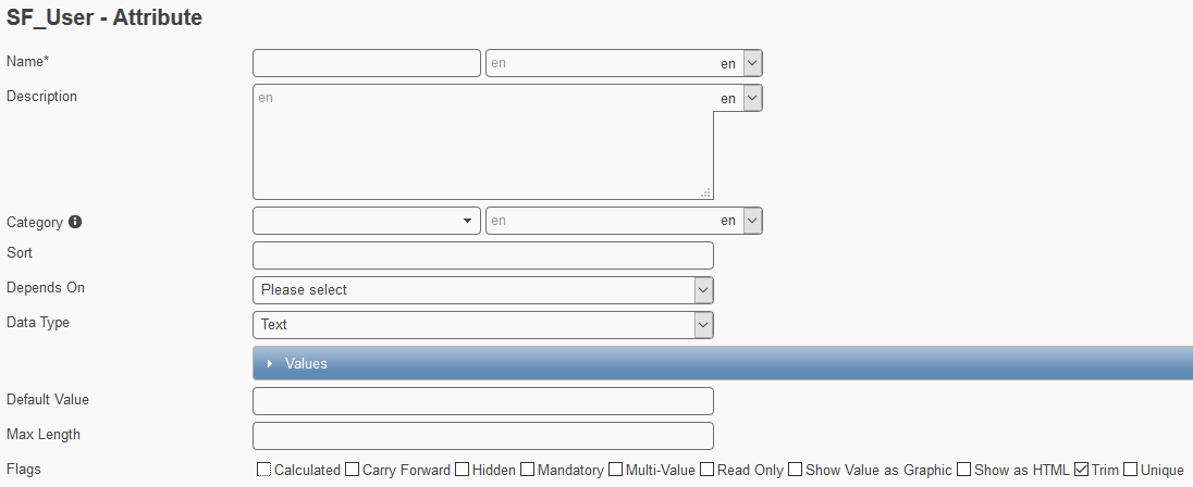
- Name
- The reddish highlighted field will be the system field (technical) name of an attribute. To the right, this technical name can be translated in any language offered by the system.
- Description (
 )
) - A description can be particularly useful, if the technical name is not self-explanatory. If a description text is set for currently used language, an info icon will be displayed at the end of an attribute field. A user can later hover over the icon and this description will display as a text hint.
- Category
- The category section classifies attributes. Again, the first field specifies a technical name for the category, which can be translated in any language on the right.
- Sort
- Determine the order of attributes grouped under the same category. Simply choose a numeric value starting from 0 and type it into the field. The smallest sort number will appear on top of the others. If two attributes have the same sort number, then they will appear in alphabetical order.
- Depends On
- Attributes can depend on others. Choose from the available options. Generally those options will show attributes that furnish at least one value entry.
- Data Type
- Several data types are available: Text, Number, Date, Boolean, Reference, Email. Please read more in the next section.
- Values (section)
- In this section, you can specify attribute choices (pre-select values). Thus the field will appear as a drop down menu.
- Default Value
- Depending on the selected data type, a default value can be set in the frontend. This value will be saved to the record.
Important
Please note that the default value needs to be scripted, if the attribute is set to be hidden!
- Max Length
- Maximum length of characters.
- Flags
- Please see the section below.
Field Data Types
Saving a new attribute will create and display a new input field in the Feeder front end. To facilitate the data input when working on data records, the field data type determines how a user can input values. Overall, there are 6 different data types:
- Text
- The default data type
- Will be an open input field if nothing is specified in the VALUES section
- Will become a pick list if values are specified. Free text can no longer be entered
- Number
- When empty, the field will contain a grey zero (color is browser dependent, in IE: black)
- The user needs to enter an integer or decimal number
- The separator is specified by the Feeder language and either a dot (2.3) or a comma (2,3)
- It won’t have any effect on the front end if something is specified in the VALUES section. Thus you cannot create a pick list using this data type
- Boolean
- Will display a check box in the front end
- The VALUES section is not available at all
- Please be aware that when a boolean field is part of the global field view, no check boxes but “true” and “false” values are listed that cannot be searched using the quick search box!
- Date
- Will open a date widget where the user can select a particular date
- The Feeder will display the date in the correct pattern
- The pattern depends on the Feeder language
- Will deny saving a record, unless a valid email address pattern is recognized
- A valid email pattern must contain the @ sign and a dot (e.g. abc@def.gh)
- Reference
- Please read more on the reference type in the next section.
The Reference Data Type
Note
This data type is used for linking and using data that is modeled in the same or another data object.
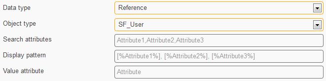
Depending on the selection under Object Type, two reference types are possible:
- Self Reference
- Reference the same data object and use the data stored in actual records
- For example realize a common manager look-up
- External Reference
- Reference another data object and link data from a record which is stored “externally”
- For example looking up position information
- Search Attributes
- A user working with Feeder can look up a user record using the attributes that are given here
- Typically: last name, first name and e-mail address of an employee
- Display Pattern
- Filled dynamically
- The attributes are in the same order as in the Search Attributes input field
- Value Attribute
- Search a user record using the search attributes
- But save the value that is given in this field
- The value attribute is not visible to the Feeder user
- Only one attribute is accepted
- Valid options are attributes that are flagged unique (e.g. USERID).
Note
For scripting information on reference fields please read more on the corresponding getByKey() function and the Line Manager Import Mapping.
Fields with Drop Down Menu
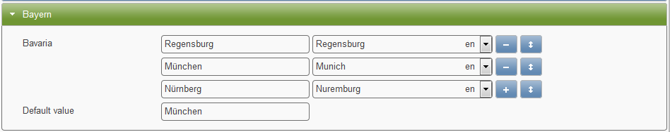
If you would like to implement a drop down menu, please proceed as follows:
- Select the text or a number data type
- Click the values section to access the input boxes
- Fill in the first value (left box). Optionally you can translate the key (right box)
- Click the plus button and repeat
Hint
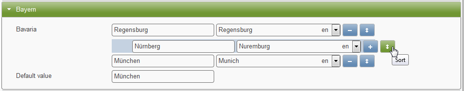
If you want to sort the values either drag and drop or activate the Sort Choices flag
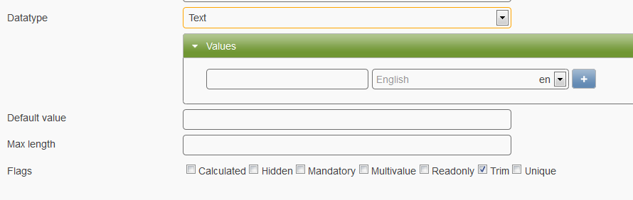
- To add another entry, click the plus symbol
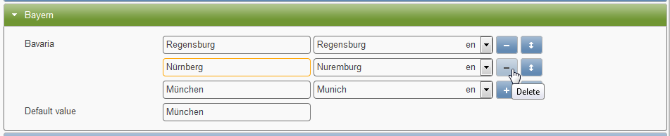
- To delete an entry, click the minus symbol
- To delete the last entry, first rearrange the order by clicking on the arrow symbol while keeping the mouse key pressed. The drag and drop to any other position in the list will add the minus button to the row. Then please proceed as usual.
Note
In case that quite a few attribute choices have been set a Show Choices Anyway button appears
Field Dependencies
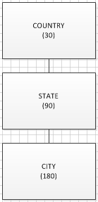
- Dependent (drop down) fields (alias hierarchy trees) are a good measure to increase data validity
- Choosing a value in the top level field will limit the number of values (attribute choices) in the dependent field on the second level
- A typical dependency is Country -> State -> City. The selection of “Germany” will consequently reduce the number of possible valid states and cities
- “Germany” -> Bavaria, Thuringia, etc.
- “Bavaria” -> Munich, Nuremberg, etc.
Hint
Typically, the strongest attribute for limitation is the one with the least values and therefore should be on the top level
Important
Hidden and Read Only are bad choices for dependent fields as those would not be updated in the front end and require special scripting effort.
Field Options (Flags)
Hint
Please be aware that the availability of flags depends on certain logics, thus some may be hidden if the combination would be ambiguous.

- Calculated (
 )
) - Selecting this option provides great flexibility as further options display (see table below)
- Carry Forward (
 )
) - Under the precondition that time slices were configured, this flag provokes an attribute’s value change to be carried out in subsequent, already existing time slices either. In this way, value adjustments must not be carried out manually. Please be considerate with this option!
- Create Index (Feeder v2) (
 )
) - Will create an index for this field and store it in the database. This will allow faster search queries.
Hint
This flag affects the Mongo database (software component) of Feeder.
- Do not track
- This flag will exclude the field from the Change History. This should be checked when the frontend user does not need to know about any changes in the field.
- Full-Text Search (Feeder v2) (
 )
) - Will create a full-text search index and the field will be found within the Full-Text Search.
Important
This flag affects the Elasticsearch (software component) of Feeder. When de-/activating this flag, it is absolutely necessary to click the Rebuild Index button!
- Hidden (
 )
) - Details of concerned attribute will be hidden from view but are available in the backend for data import/ export procedures. Applicable for confidential or calculated data.
- Mandatory
- Only if all mandatory fields are filled out, an employee (data) entry will be cleared for export to SuccessFactors.
- Multivalue
- Field where multiple values can be selected. Please separate these using via ENTER.
- Read Only (not editable)
- Field cannot be filled or changed in the front end by user interaction. Usually it is used to display “calculated” values like unique IDs or usernames.
- Show Value as Graphic
- Special option to include icons in list views. See Attribute Visualization for more information.
- Show as HTML
- Option to display a text as HTML link. Requires the calculation flag and HTML code too. See HTML Linking for more information.
- Sort Choices (!)
- This option will show only if at least one attribute choice (drop down value) is specified. Feeder will then automatically sort all given choices and it does not need to be done manually by drag and dropping entries.
- Trim
- If enabled removes leading and tailing white spaces of entered values
- Unique (
 )
) - Calculate or force user to input unique data. If activated, the mandatory flag will be activated too.
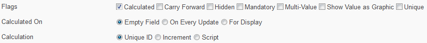
- Empty Field
- Only if field is empty, calculation will run and results are written into the field
- On Every Update
- Calculation runs every time a data entry is updated
- For Display
- Has to be ticked to visualize an attribute
- Unique ID
- Calculates a unique ID
- Increment
- Increments a counter starting at 0
- Script
- Feeder-specific JavaScript code further enhances the program’s capabilities. Please read more in the Feeder Scripting section, for example under Scripts for Attribute Configuration
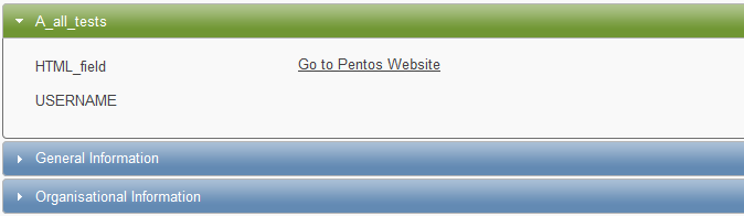
HTML Linking
- Sometimes it can be useful to guide a user to an external web page.
- Therefore the Feeder offers the Show as HTML flag (as of version 1.10).
The following screenshot demonstrates how an attribute (Text) can be configured to open the Pentos website in an extra tab of the web browser:
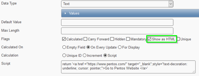
return '<a href ="https://www.pentos.com/" target="_blank";style="text-decoration: underline; cursor: pointer;">Go to Pentos Website </a>'
Important
This option requires the Calculated flag and HTML code! Please refrain from any combination with the flagging options Read Only, Unique, Hidden as these are illogical
Script explanation:
The JavaScript code snippet:
return 'place the HTML code in between the quotation marks';
The HTML code:
<a href="https://www.pentos.com/" target="_blank" style="text-decoration:underline cursor:pointer">Go to Pentos Website</a>
- href = “https://www.pentos.com/”
- Link to targeted website
- target = “_blank”
- Will open the website in an extra tab; if not used the user will leave the Feeder application
- style = “text-decoration: underline; cursor: pointer;”
- Changes the appearance of your mouse pointer and underlines the text
- Go to website
- Any text that you would like to be displayed within the Feeder frontend
The HTML linking result: